Wednesday, November 23, 2011

Blending the Old With the New

I know many of you have this same dilemma that my clients had. You are stuck with hand-me-downs that you can't afford to or bring yourself to get rid of. Here I will give you some ways to give that old set some new life!
First find an inspiration fabric or something to start you off and build from there. We found this traditional print done in a fresh new way at Calico Home and used that as our starting point. We pulled in the wall color from the fabric which is BM Whitall Brown, then added the off white bead board wainscoting to keep it from feeling too dark. We made the drapes out of the fabric and to keep the cost lower we added an inexpensive brown to the bottom. We only needed 2 1/2 yards of the printed fabric per panel.You can do this trick with store bought panels, as well.
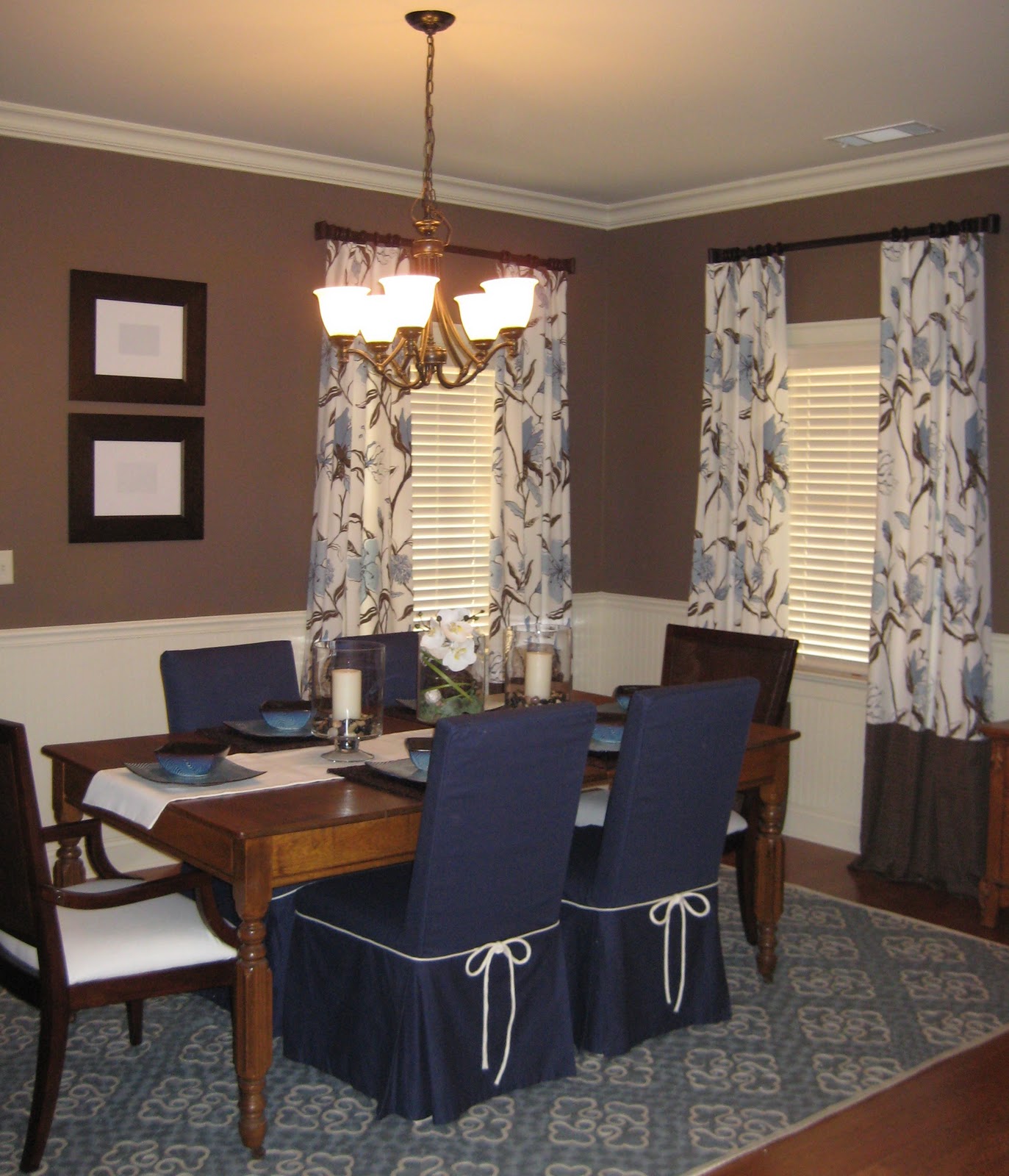
Grandma's Dining set is given new life!


If you have older chairs, we just slip covered these and added two new transitional chairs to the head of the table.  Now the set feels more up-to-date! The rug really adds that hit of contemporary to the room. We found this gorgeous dhurrie rug at William Sonoma Home on sale, it was a little bit of a splurge, but the result was worth it! The final touches like new dishes and accessories really pulled the whole update together. Now she and her family can have that sense of history by keeping Grandma's pieces. But at the same time, enjoy a fresh new dining room that reflects them. It's the best of both worlds!

Tuesday, November 8, 2011

My "real life" take on dining rooms!

They are the most neglected room in the home, but usually the first room you see when you walk in the door. Yes, we want them to look good, but how do we create a room that welcomes guests and can be used on more than just the special occasion? Here's my philosophy on creating a "real life" dining room.
Keep it casual and inviting!
I feel the biggest mistake we make is we create this formal space that is filled with the traditional dining "set". We paint the walls dark reds or brown and think we can only use the fine china. Then we  neglect the room for the other 362 days of the year! That is such a waste! Here's are the elements, as seen in the picture above, that I think make a more inviting space that you will use so much more than 2 or 3 times a year.

1. Keep the colors brighter - I love using blues and greens or versions of those colors against the deeper browns of the wood. You can also use warm soft neutrals, like It keeps the room from feeling heavy, dark, and stuffy!


2. Make the furniture more casual - I like using upholstered chairs, because they create comfort and make you want to hang out and relax at the table. I also think mixing in a different chairs or a bench to keep it casual is a fun idea. Mix in a more casual table. I love round tables, because they promote conversation. Then add in  a buffet for storage and serving. Just remember all the pieces don't have to match! You can even just slip cover an old console table.
A simple slip covered console keeps the room light and casual


3. Keep the decor simple and casual - You are not going to use the room if you have to unset the table and remove a bunch of bulky decorations every time. So a simple center arrangement is all you really need. If you have a long table add 2 candles on either side of the centerpiece. I like using baskets and natural elements to keep the feeling light and casual. Put your centerpiece on a woven tray or try a jute or sisal rug instead of a formal wool rug, plus it's less expensive!

Voila! The room will be ready to use! 
  • Use it for a change of scenery on the weeknights and make spaghetti night a little more special!
  • Don't have a sitter? Use it as a special date night room on the weekends to give a more elegant and romantic setting for dinner for two.
  • We use ours every Sunday as our breakfast room. Bacon just tastes better served in the dining room!
Most of all enjoy gathering together  and spending quality time with friends and family. I mean isn't that what "creating home" is all about!

*If you enjoy my blogs, please become a follower and share me with your friends!


Saturday, October 29, 2011

Sumptuous Saturday

Hola Fall!
SH/CH is now adding Sumptuous Saturday's to my weekly Creating Home blog and posts. I want to share an easy recipe and help set the table for some family time! This week we are taking fall south of the border. Always a family favorite!
Please feel free to share your favorite family recipes.
Create a special setting, even if it is just a Saturday night!
 Nothing welcomes the cool evenings of fall like a warm bowl of soup. This week I am sharing one of my quick and easy soups with you, Cheesy Taco Soup.  
Muy Delicioso!
Recipe:
2 cans of chicken broth
1 can of water
1 can Rotel Cilantro Lime flavor
1 package of Old El Paso Cheesy Taco seasoning mix
1 cup of corn
1 cup of black beans
2 cups of pulled rotisserie chicken
Serves 4
Combine all ingredients (you don't have to be exact with the measurements) in a large pot and simmer for 15 minutes. Serve with corn chips and sour cream for a yummy topping. 
You can double the recipe to serve more - and have left overs! 


If you like my blog follow me and share me to enjoy creative, practical, and budget-friendly advice to help you create your home!

Friday, October 14, 2011

Creating Cozy!

Bright and Airy Summer Decor

Goes warm and cozy for the cooler months!
Pillows From World Market all under $100
I have to admit, I was a little worried about how to take my living spaces from my bright fresh light teal blues and greens to the warm and cozy feeling we all crave in the colder months. Here's the easy of it all. Just change out your pillows! Pop in a warmer color and add deeper versions of the colors you already have! It will work I swear! My light smokey teal pillow paired beautifully with burnt orange and deeper teals to create that curl up by the fire feeling I wanted! Then just splash the same colors around the room in candles, fresh flowers, and accessories.
Now all I need is a fire!   


I added these cozy orange floor pillows beside the fire place by covering euro size pillows with some left over fabric from another project. Now there is a reason to get cozy by the fire! Other small touches like the deep teal candles and the orange flowering branches, add more of those warmer tones. A homemade spray of leaves, berries and pine cones finishes off the fall look!

See it's that easy! Now go and cozy up those rooms, cold winter nights are just around the corner!

Thursday, September 29, 2011

Creating Autumn

This easy-to-make arrangement is the center of attraction in this traditional dining room. Here's all you need: 3 hurricanes with candles, set of three plates to set candles on, stems of fall foliage and berries, small pumpkins and gourds, and large pine cones (from the yard). First, I lined up the hurricanes down the center of the table. Then place the stems of leaves and berries all around. Finally, I tucked in the pine cones and gourds. It was that easy!

Fall colored pottery made a perfect back drop for these stems of berries and leaves. I simply arranged the pottery in a triangle-like pattern, then filled one of the jars with fall berries. I used ready-made fall picks and tucked them in between the pottery. Be sure to use natural-looking picks that are full and colorful for a realistic look.

Coffee tables are the center of attention in the family room and a great place to add a touch of fall. By simply changing the candles to a burnt orange and popping in some fall blooms in the arrangement, I created a beautiful burst of autumn! I love that the birds look like they are nesting in a a bunch of fall leaves: it's a fun touch!
Welcome to Autumn!

Wednesday, September 14, 2011

How to Avoid Painting Disasters!

Yes, even design professionals don't get it right all the time!
First color was pretty, but way to Palm Beachy!


Okay, yes I admit, I don't always get it right! Decorators even struggle sometimes with the right tone of a color. Sometimes you think you are getting one thing and then you put it in the room and YUK! It turns out all wrong! Here's my advice to you, keep the tones shaded with gray and you are more likely to love it in the long term. Sometimes a truer  brighter hue works, but for me a grayer version of the teal was a much more sophisticated way to go. My big mistake was not getting the sample and I wasted $40! So the next tip is alllwayyys get the samples and test it out, then you know how to tone the color down once you get in the room. Maybe you'll get lucky and strike gold the first time!
SW6214 Under Seas, Perfect!
One more bit of advice. I ended up taking my spa blue pillow back to the paint store this time and was able to get a better match. So when in doubt always take a color inspiration with you. I went for a deeper value than the pillow or darker version to give some contrast, but it was still the same tone.

So for color success: 
  • Go for grayer or shaded versions of a color, it's more livable in the long term  (mainly in blues and greens).
  • Take something with you to the store for color matching or inspiration.
  • Always get a sample to test in the room.

Thursday, September 8, 2011

Three Ways to Style a Mantel

Most of us have them, yet are perplexed at how to make this focal point shine!
Let the Fireplace be the star of the room!

Of all the design issues I see when I first walk into a clients home, its how they have styled their mantels! I see the same thing over and over and I want to help! Most of you take this ledge and make it your gallery of keepsakes . Pictures of the family, the ubiquitous figurine, and a clutter of other small objects. The problem is where's the focal point? I am not saying you have to get rid of all the sentimental items, just let me show you how to display them.
Use one key piece of art in your arrangement

This is your basic mantel. By using the hanging art and the 2 sconces you have created a focal point that is in scale with the fire place itself. So now the whole fireplace is one cohesive unit. As you can see the other things are displayed with purpose and in an asymmetrical way. This gives it more interest. But at the same time they match in scale. You could put the 2 planters on either side and make a more symmetrical arrangement as well.

Don't fight the stone with busy art!


For those of you who are lucky enough to have the natural stone as your fireplace, this one is my favorite! Because quite simply the art is in the stone, so the use of simple art, like this one, doesn't compete with the stone. I will typically use an antique mirror to contrast with the muted stone. Candle sticks are always a go to accessory for any mantel, just make sure the size matches the scale of the mantel.


Of course, now a days we have big black boxes, aka the flat screen TV, above the fireplace. One cool way to make it less visible is to paint a darker color on that wall to lower the contrast. See in this picture you notice the fireplace and not the TV! Then keep the accessories simple, to keep it from being too distracting.


Hope this helps!